30 Years Crunch
Crunch turned 30 years old and we took it as an opportunity to take a walk down memory lane. We let the feeling of nostalgia bleed into the present and brought back trends from the brand over the years. The theme of this campaign was “30 years [insert descriptor].” We wanted to create the sense of connection among the Crunch community and who people are as individuals. While we used verbs such as, strong, fun, weird, fit and fierce, for our marketing collateral, we also gave our members the opportunity to fill in their own blanks.
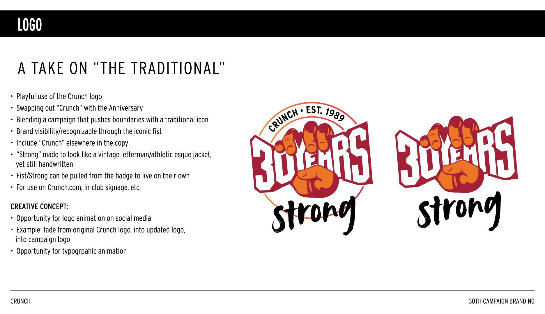
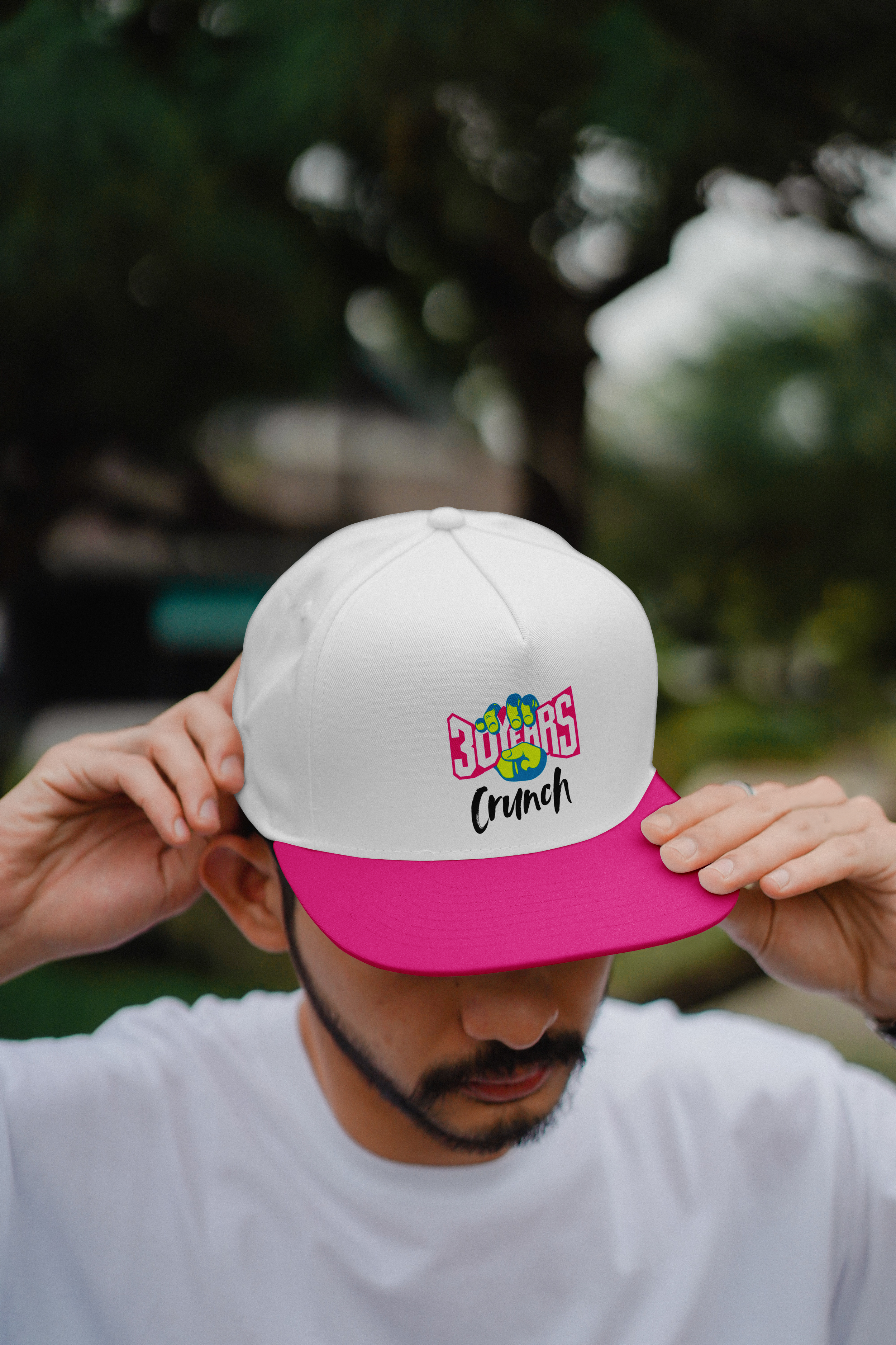
For the look and feel of this campaign, I reformatted the logo to celebrate the milestone, by embedding “30 years” within the fist where the “Crunch” name usually lives. I pulled in pops of vibrant neon colors, color overlays on photos, and handwritten fonts to add more personality to the campaign. We also brought back items from the past to evoke feelings and memories – think: slap bracelets, trucker hats, knee-high socks and sweatbands. This was a celebration of not only three decades of Crunch, but the people who make it what it is.
Skills:
Visual Design
Art Direction
Production Design
Credits:
Lauren Kanfi, Design Director


