Crunch 2.0
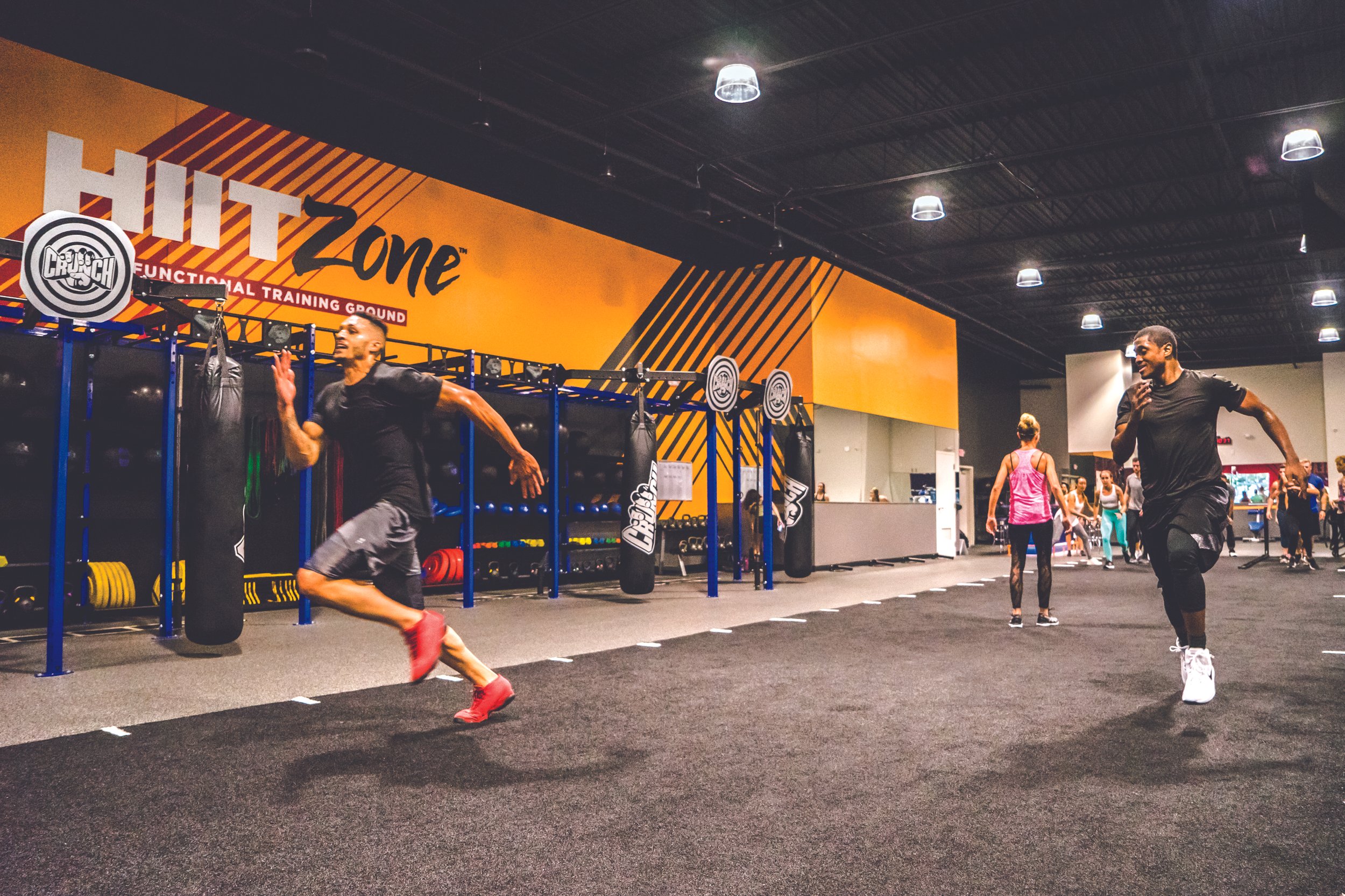
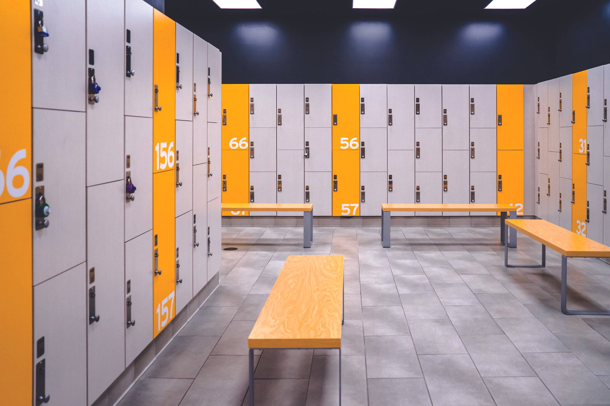
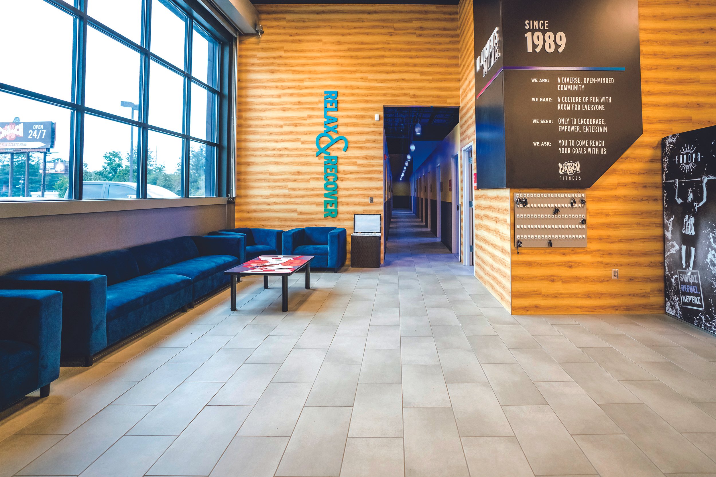
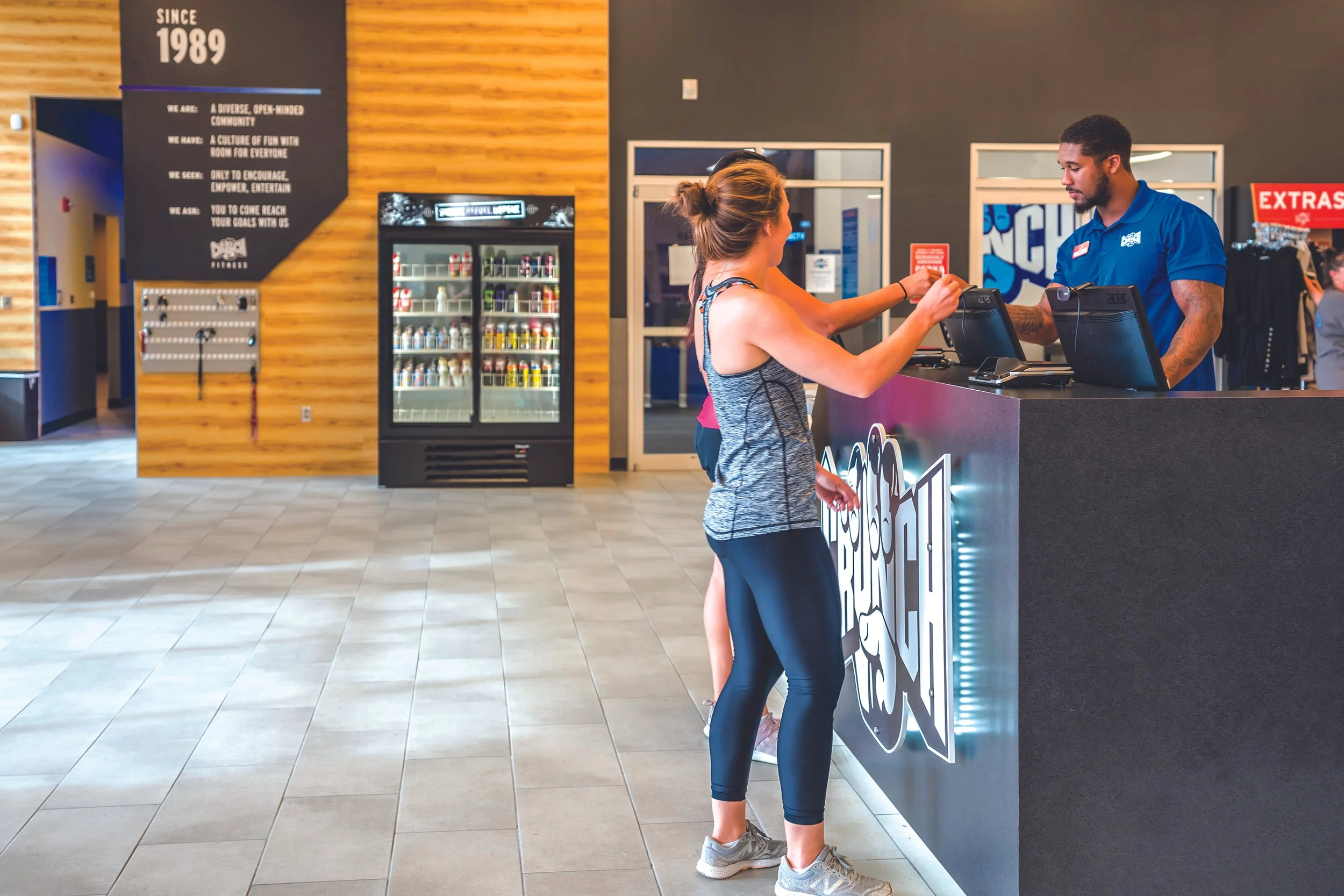
Tasked with facilitating a partial rebrand of the Crunch aesthetic, we wanted to elevate the space with a more cohesive look that created continuity throughout the space. The use of varying line thicknesses gives the illusion of a seamless gradient transition from color to color across the perimeter walls. Each color represents a different zone within the gym, and is grounded with a phrase called a “crunch-ism” that is intended to inspire the gym patrons. The use of diagonal lines conveys the feeling of constant movement, and combining that with an open floorplan and the use of bright colors, creates a more inviting environment that is a departure from your typical gym experience.
With each new gym opening, I needed to evaluate the layout of the space, and designate paint colors and graphic placements. This involved preparing mechanical files and resizing graphics to fit each individual wall space, as every gym layout is different.
Skills:
Visual Design
Production Design
Credits:
Lauren Kanfi, Design Director
Photos c/o Crunch


